MAKING catalogue of unmarked days


overview
As the COVID-19 pandemic set in motion a number of social cataclysms, the process towards normalization has been arduous at best. In witnessing some of the struggles my partner has gone through adjusting to these circumstances, I found it worthwhile to design a tool that might alleviate her troubles. Specifically, I wanted to address the ways in which disconnecting from the physical world has negatively impacted her.
Prior to the pandemic, a significant portion of each day was spent roaming through various spaces, from home to work or school and back, with occasional ventures into unfamiliar territory, such as restaurants, shopping centers, neighborhoods and natural environments. In doing so, one would experience the passage of time through movement. Once staying inside became a priority, those passive interactions through travel were lost. And while it is still possible to leave the house, there's an added level of anxiety present, preventing it from feeling as freeing or explorative as it once did. Consequently, time itself has compressed into a liminal space, where days pass unremarkably and an aura of stagnation looms over each moment. To combat this feeling of stasis, Catalogue of Unmarked Days provides a means of delineating the passage of time, with an emphasis on seasons as a natural signifier of transition.
The Catalogue, developed using p5.js, accomplishes this in multiple ways: first, each week has an associated background image and quote, meant to coincide with that time of year. Alongside the shifting backgrounds and text are ambient noises, which update bi-weekly, three ambient music tracks, and a set of minigames which alternate between days. Finally, each day reveals new content, in the form of an icon unique to that date, with the ability to view the last 30 days worth of content and transition between seasons on any given day. Overall, the project conveys change on a micro (daily) and macro (seasonally) level, where the visual nature of assigning icons to each day and backgrounds to each week, creates a more visceral means of association, in ways a traditional calendar might not. In other words, it has the potential to form memories, at a time where moments seem to drift inconsequentially and forward momentum is desperately needed.
IDEATION


Research
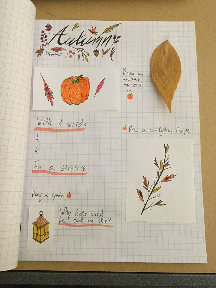
Once I'd set out to develop a tool for my partner, my primary research inquiries were structured in the form of a design probe. I organized the probe around the seasons, knowing from conversations I'd had with her up to that point, how much she'd been missing the outdoors. Aesthetically, the probe mirrored a hand drawn notebook, in an attempt to create a more personal artifact and connect to my partner's love of journaling; the success of which would go on to influence the look and feel of the final design.
The main aim of the probe was to gauge what about going out was important to my partner, through a series of questions and tasks. Questions ranged from single word association with seasons to more in depth responses about what makes natural environments appealing and how she would describe them. Meanwhile the tasks were mainly centered around drawing, as I felt it would provide a more abstract means of conveying the emotional resonance of nature, in ways that might be difficult through words alone.
Insights
Going into the process, I anticipated the final tool would find ways to replicate the feeling of being in nature, which the probe would inform me how to do best. However, the results of the probe revealed a much greater emphasis on making memories, which traversing the outside world was just a conduit for. Obviously, I expected winter to have strong associations with the holidays and family. But surprisingly, for my partner, what was enjoyable about each season connected back to some form of nostalgia.
That led me to the realization that it wasn't the literal sensation of feeling trapped inside that was distressing her. Rather, it was the fact that, while inside for such long periods, it had become nearly impossible to distinguish noteworthy moments from the mundane, as they all blurred within the same space, and consequently, time. Without a clear indication of when an event occurred, generally informed by place, time of day, and time of year, it becomes very easy for yesterday to feel the same as three weeks ago, as three months ago. This produces a state of prolonged limbo, where nothing of import manages to stick and change is never on the horizon.
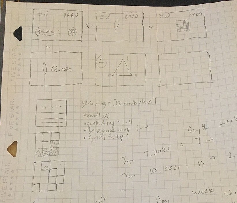
Initial designs
Before designing the probe, I knew the final tool would be web-based (using p5.js), as it provided the most avenues for access and repeated use. After receiving feedback from the design probe, I began translating my insights into tangible features that would be implemented in the final design, which broke down into the following:
Adventure is the anticipation of enjoyment → Interaction to unlock content | Interactions throughout
Have small moments of discovery → Daily change in content | Easter eggs
Memorability and repeatability are important → Option to view the past | mix of choice and randomness
Ambiance leads to relaxation and reassurance → Music + animations to leave running in browser

As I mentioned previously, my partner's reaction to the probe made me want to incorporate some form of hand drawing into the overall aesthetic. I also found using my hands to be somewhat therapeutic. As the pandemic demands a majority of time be spent online, any kind of physical craft was a useful means of escape. Additionally, it gave the project a more intimate style that suited the nature of making something for a loved one.
However, I felt the final design should remain mostly user agnostic, meaning anyone could use it, even though it was designed for one person in specific. The easiest way to accomplish this was incorporating the hand drawn icons into a fairly traditional user interface, shown left. Examples of other early layout options can be seen below.


Process

Main Functionality
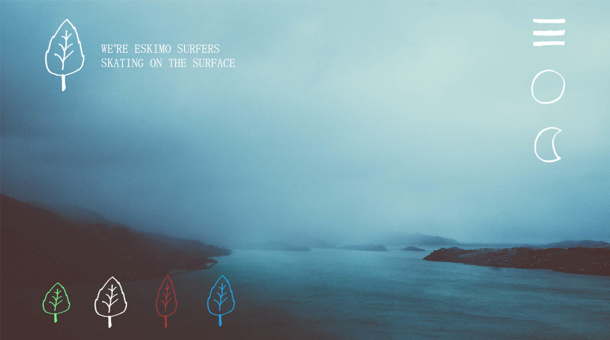
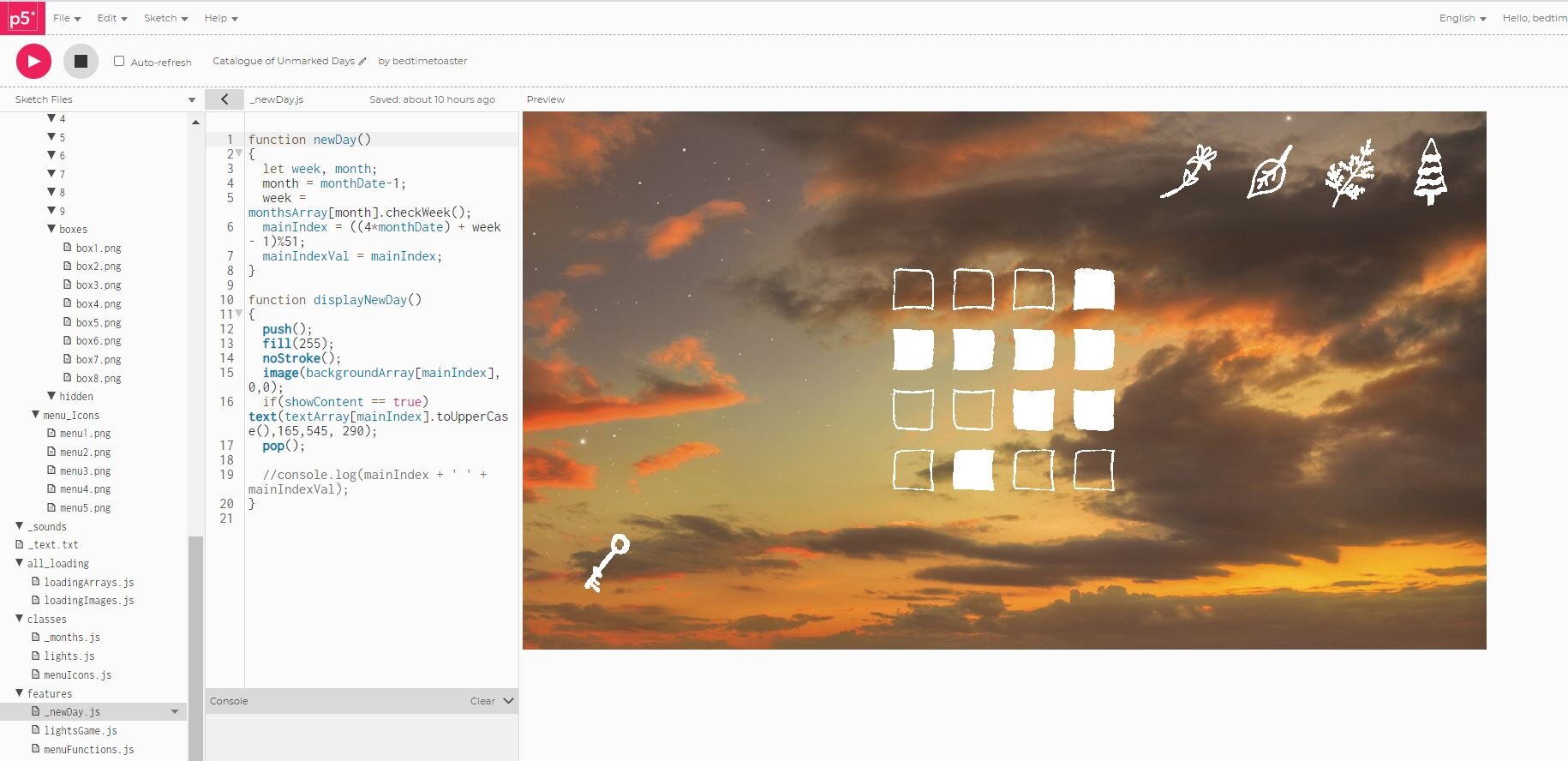
The final layout can be seen left. Delving into the some of the central elements of the project, each day defaults to a specific background, quote, and icon. The four icons in the top right allow users to switch to corresponding days in different seasons, thirteen weeks apart.
Hopefully, the ability to view future and past weeks on any given day creates a sense of continuity. As one could either look backward and recall the content of weeks from previous seasons or look forward to what's coming in future seasons. In that way, interacting with the Catalogue is a cyclical process, with the intention of promoting memorability.


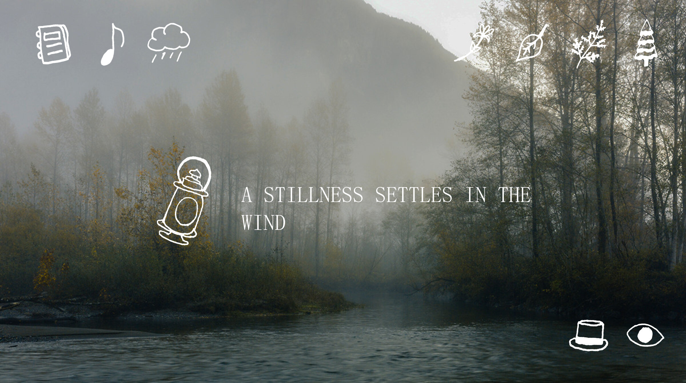

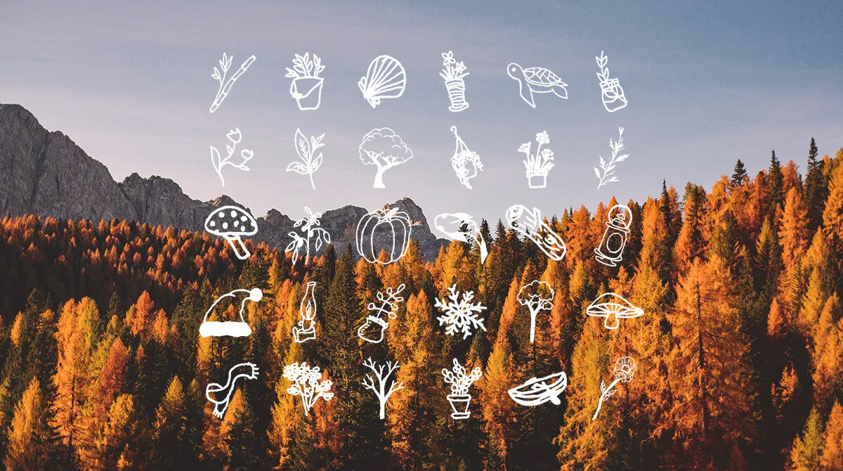
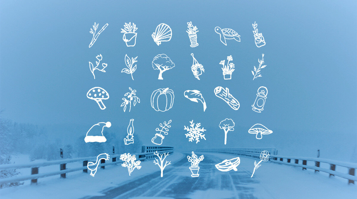
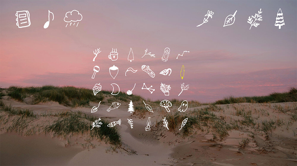
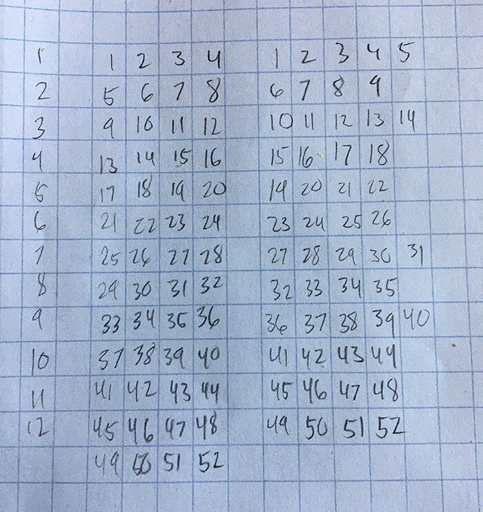
The choice of text was based on what I felt would suit my partner's taste. Therefore, the resulting mixture of phrases either have some shared meaning between me and my partner, reference older projects we've made together, or evoke a sense of seasonal nostalgia/wonder. Meanwhile, the backgrounds were royalty free images, edited to create a consistent color palette and style across each season. As for the icons, only the current day's icon is specific to that date, the other 3 season's icons rotate between a set of seven per month. That way it's not possible to view the entirety of the Catalogue in a single season. Each icon was hand drawn and transferred to a digital format, see below.

The decision to only include 52 backgrounds and quotes, despite having 366 icons, was twofold. First, sourcing 366 quotes and images would've been significantly more labor intensive than drawing the 366 icons. Second, having the entire interface change daily would feel like too much variety, making it much more difficult for users to form connections between the content and real life events. That would work against the main objective of the project. As it stands, having the gradual shift of weekly background + phrase updates, coupled with the daily icon updates, means there's a reason to view the project each day, without it feeling as though everything is in constant flux.


Unlocking Content
In order to view the Catalogue's contents, users must first complete a 4x4 light puzzle. It's inclusion was based on feedback from the design probe, which coveted interaction. It also gives the program time to load the assets, which takes a while with hundreds of image files. The introductory animation serves a similar purpose.


Log of Past Days
Catalogue of Unmarked Days is named for its log feature, which is accessed through the notebook icon in the top left. It shows the last 30 days worth of icons. When an icon is selected, that day is displayed, meaning users can revisit the past 30 days of content. The day currently displayed is highlighted in yellow, see left.
The choice to show only 30 days was based on a monthly calendar layout. The log itself was meant to mimic a sort of advent calendar, where each date brings something new. Simultaneously, it relieves some pressure from users if they choose not to visit the site each day but still wish to see a majority of the content.
Music & Ambient sound
Another feature prompted by the probe was the addition of sound. My partner often plays ambient music or nature sounds as background noise while engaging in activities. The Catalogue allows for both. There are 26 ambient loops that correspond to two week pairs and 3 ambient tracks that are chosen from at random. The ambient noises were sourced from free use field recordings while the music was self produced.
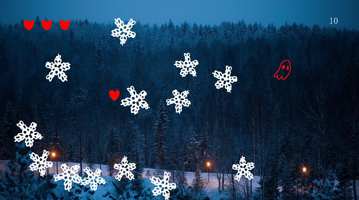


Minigames & Animations
Originally, I planned on including a few hidden features that appeared infrequently, per my partner's interest in discovering Easter eggs. However, those features would morph into a set of 4 minigames and 2 animations, one of which is linked to each day and accessed through the eye icon in the bottom right. After developing the first minigame, I found it enhanced the project in several ways.
First, it gave the backgrounds a sense of space, allowing them to feel more occupied and traversable. This furthers the primary goal of memory formation, as the time spent playing the minigames feels like inhabiting the world of the Catalogue. Second, it added a great deal of variety to each day's content. Since the objects that populate the games are each day's icons, there are a large number of configurations. This helps increase replayability, as each day's experience is slightly different. In addition to the minigames, there are two animations, which are meant to fill the remaining days where a game isn't present.


Hats & Hat log
Finally, the hat log allows users to unlock hats to be worn in minigames, through the games themselves or various interactions within the Catalogue. There are 30 hats in total and the hat log is laid out in the same way as the main log. Hats which have been unlocked are highlighted green, while the currently equipped hat is yellow, see below. Selecting a hat which is not unlocked will display the requirements to unlock the hat.


Similar to the minigames and animations, the hat log added another layer of interaction, giving users a reason to play each game and return to unlock more hats. Between the main log, music, ambient sounds, season controls, hats, minigames, and animations, there's a bevy of options when using Catalogue of Unmarked Days. The end result is a tool which can generate a diversity of experiences, both memorable and comforting, during a period of global distress and inertia.
Gallery
Early interaction flow ideation
Assigning overflow weeks to certain months for backgrounds + quotes

Developing interface, circle indicates icon has been clicked

Logic for assigning daily icons, week 5 = week 1 of next month
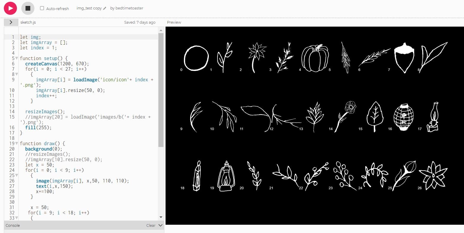
Loading icons test
Developing the logic for assigning backgrounds, quotes, and icons


Live gameplay & animation capture


